
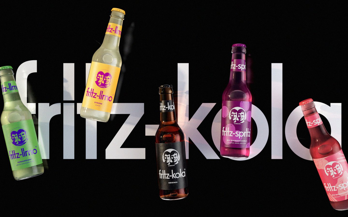
Adding to its classic collection, which has always been “unified by a black imprint”, says Ben, was a way for the cola company to serve up some new fruity flavours that bring not only new colours but also some playful illustrations into the brand’s visual oeuvre. Amongst all of this however, the brand’s logo has stuck. Originally a black-and-white, photobooth-style snapshot of the founders’ faces “produced from a photocopy of a photo, to save on print costs in the early days”, says Ben, the brand’s iconic visual signature hasn’t changed since its creation 22 years ago.
Giving Fritz its distinct identity and connecting the brand to its inspiring startup story, the team at Robot Food had no intention of doing a “rip it up and start again job” when it came to revisiting the logo. From testing out all sorts of variations for a refresh on the design, the agency found that the founders’ faces “had always resonated best” and set out to refine, rather than rework, a bolder brand mark using the original image – working closely with illustrator Chris Mitchell on the new version.
In a similar vein, the the Fritz-Kola word mark itself was left untouched, instead the typographic word mark was rebalanced with the bolder logo to create a more striking combination – meaning the new, more colourful range stands out on shop shelves but also stays true to “Fritz-Kola’s unique world”.