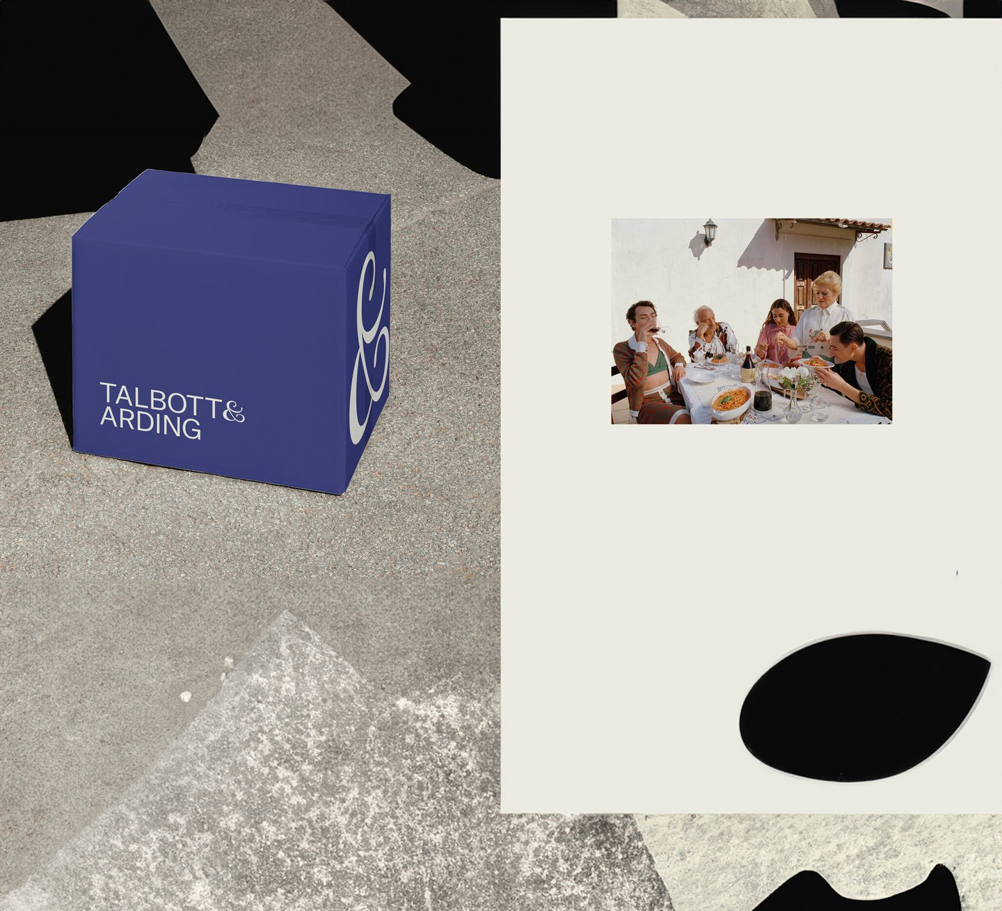
Apart from a singular commanding ampersand, Jessi Brattengeier wanted the branding for Talbott & Arding to look composed. The ampersand, which, among other concepts, references the collaboration between the provisions shop and local farmers and makers, would feel more impactful when it breaks through the system if the rest of the identity was stripped back. Jessi, design lead on the project and creative director at The New York Times, also knew she wanted long-time collaborator Vivian Dehning to design the shape: “When I received the brief for this project from Superhyve, I immediately thought of Vivian’s elegant lettering work,” she says.
The idea of elevated quality, after all, is a core aim with this rebrand. The entire identity for Talbott & Arding is focused on capturing the traditional techniques found in the Hudson Valley, a locale known for its farms, vineyards and produce, and Talbott & Arding’s home. “We wanted the new identity to feel just as crafted,” says Jessi.
The tone touches upon two distinct notes. A very serious sense of composure is established through the rich blue, which has been updated to be deeper and is paired with supporting creamy neutrals. But there’s also a quainter sense of place established, specifically in photography.

